Mar 25, 2011

Avatar Reflection/Evaluation

Avatar Reflection/evaluation:

With my avatar I had a few difficulties, but I am pretty pleased with my result.

Something I found hard was finding the right image for my avatar, because I already had an idea in my head, & so finding the perfect image could take even up to an hour. Secondly I also found it a bit difficult to do the lips perfectly, especially on my last avatar, because even though it was a large image, when I zoomed in to do the lips, it was very pixelated.

I also had some trouble with time management, especially with my blog. This was because I wanted to put the whole process at once not separately.

Something that really helped with the process was my personality profile (planning). I didn’t use the personality profile planning sheet given to us on Blackboard, however I wrote it myself & this helped me to plan the making of my avatar. It was very useful because I keep referring back to it to check if I had forgotten anything.

While making my avatars, I learnt a lot of skills & techniques such as different types of liquify, how you use a preset in hue/saturation & many more skills.

I am mostly satisfied with my end result. However, I think that if I had spent more time trying to perfect certain things, I would of been happier with my final avatars.

If I was to redo my avatar, I would make sure that I as always using a mask & not rubbing out completely because not using a mask often set me back quite a bit.

3RD AND FINAL


This is my final avatar, and is just an extra one i decided to do, but isn't a good as my other ones.
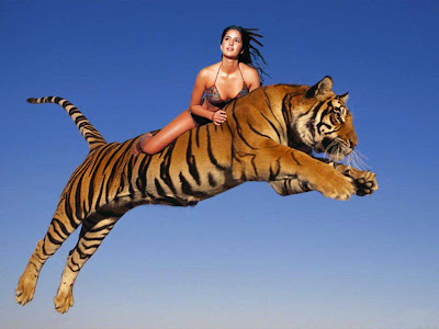
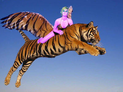
My starting pictures were these, and I put the girl on top of the tiger because she is flying on the tiger.

Then it looked like this:


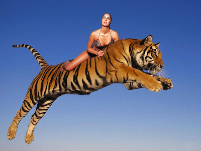
Then I masked out her hair:


Next i wanted multicoloured skin, so I duplicated the skin twice so I had three different one, the made then all different colours, and using the same technique as I did for my 2nd avatar with the eyes and lips, I rubbed out certain parts on each layer to reveal the layers below, making a pattern. I also used the original girl to keep her clothes the same colour and not changed colour::


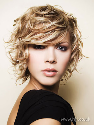
Then I did the same with the hair I chose. This is the original hair::

THis is it on the girl and coloured::


Next was the eyes, with I just used exactly the same from my first avatar::


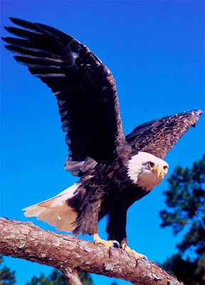
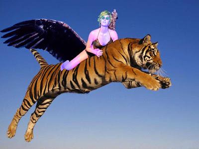
Then I added eagle wings to the tiger so i could fly, therefore making it a teagle. This is the eagle:


ANd this is them on the tiger:


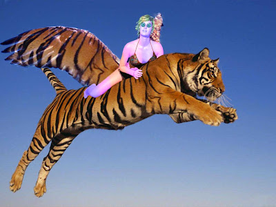
Then I selected a certain part of the tigers pattern to use as an overlay on the wings to make them look like they belonged::

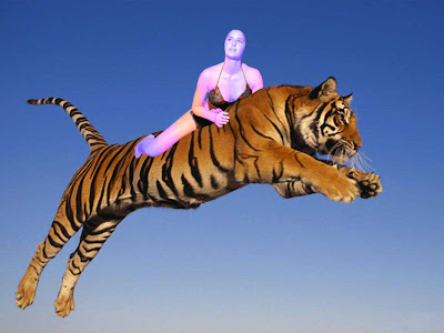
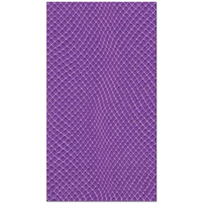
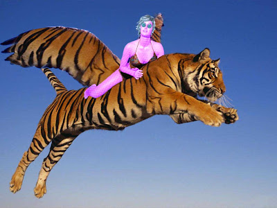
Then I decided I didn't like the multicolour skin, and it meant I could use a snakeskin or would be to hard, so i just make the skin pink, because it is their neutral skin colour thing (as mentioned in Personality Profile). Plus I added a snake skin to it. THis is the snake skin::


This is it changed to pink with the snakeskin::


Because I changed the skin to pink, it meant I had to change the hair as well back to just blue, and I also did the lips and made them blue. This is with the hair::


This is with the lips, however, I couldn't get them right, and they looked really wrong, so I just left them:


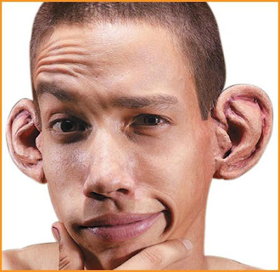
Next I added bigger ears that I got off the internet. I used these ears:


And put on they looked like this::

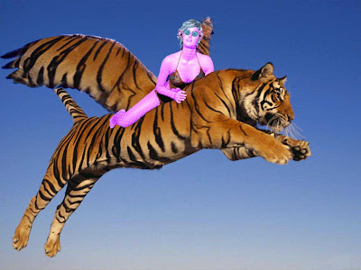
Finally, I duplicated and flipped the ear and used hue/saturation to make it the same colour as the skin. This is the final image::

Mar 20, 2011

My 2ND avatar....


Ok, so because my second avatar is from the same race as my last, the process will be mostly the same, however, because they react differently with this emotion, it has some very different parts. SO here is how I did it::
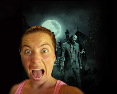
My starting image was this:
THen i masked it and put it in a scary background (ohhhhhhh, SCARY!!!):

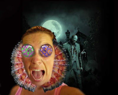
NExt step in the longggggg process was to add the water dragon/lizard feature that they adapt when they become scared or defensive. I chose a water dragon because i wanted the fin thing around the neck, and this is what it looked like on the girl:
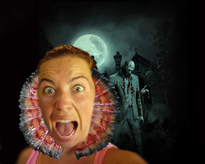
THE next step was the eyes, which i later changed, but I what I did was get the eyes from my last avatar, and change the colour. But because they needed a pattern, i duplicated them and changed the colour, for each layer of each eye, then rubbed out parts so you could see the colour of eye underneath and it created a pattern. I used these colours because they contrast each other, and look cool. This is a picture of it:
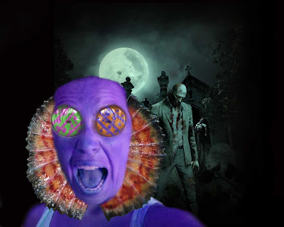
Next step was the skin. I had to change the colour of the skin to purple, and did this using hue/saturation:

Also, i wanted to make her look more scared by giving her bigger pupils, but i didnt like it, so lef tit, but this is what it looked like:::

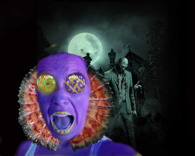
Next step was the lips, and I did the same process with the lips as the eyes, just a slightly different pattern. I found it hard to make the lips blend into face easily because of the colour. But this is how it turned out...

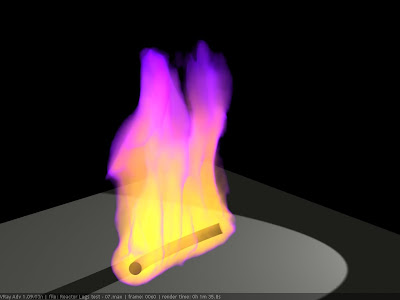
Next was the hair. It took me a long time to think of and find what I was going to use for hair. I finally found some yellow flames which were perfect, it had purple at the end, but i just got rid of it and only used the yellow. The flames also helped with portrayed her emotion, which is scared. The problem was it looked really weird with just one layer of it, so i duplicated it alot of times to give it more volume. (It has the snakeskin on it, even though i hadnt done it at this stage, because i forgot to get rid of it when saving the JPEG) This is the original image of the flame::


This is it unduplicated::


This is it duplicated:

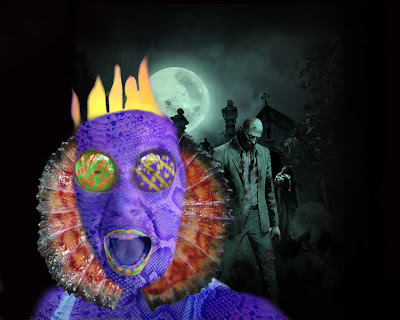
But then i thought the hair kind of looked like a crown, and didnt fit, so instead of changing it completely, i just added a fringe. I did this by selected certain layers of hair, duplicating, flipping and resizing them then masking and erasing them so that they looked like a fringe. then to give it more volume I just duplicated it again, to look like this:
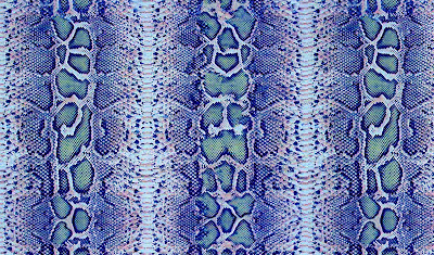
THe next step was the snakeskin, which again I probably done earlier, but anyway. I had to find a purple snakeskin, and so I chose this one::

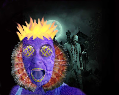
And after I masked it and added it, it looked like this:
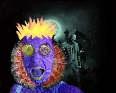
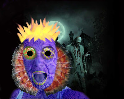
After this, I had finished doing all the things that i put in my personality profile, so because I wasn't entirely happy with my result, I started changing things to see what they looked like. First I tried bigger pupils to make her look more scared. I did this by making 2 black circles and just placing them on the eyes::

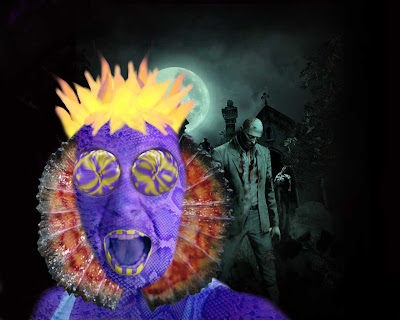
I didn't really like this, so I left it how it was. Next thing was the eyes, i changed the colour because I wanted the eyes to match::

Then to match the eyes I changed the lips and made them stripped by changed the mask.
Then, I wanted to change the eyes, so I tried different liquify techniques on the eyes and picked my favourite. This was the bloat on the eyes, but i didnt really like it::


This was just the normal liquify technique, and i didnt really like it either::


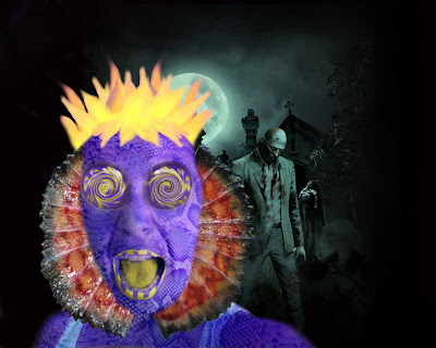
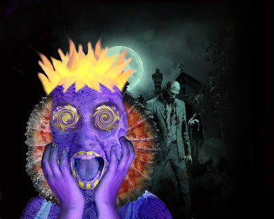
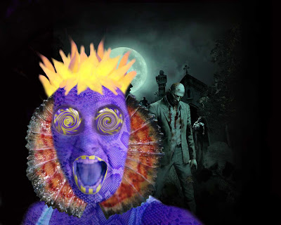
This is the final technique and its swirl, and this is what i chose because it looks cool::
Then I tried a yellow tongue using a mask and hue/saturation , which looked really bad::


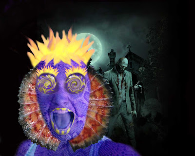
THen to make her look even more scared again, I made a new layer of her lips and transformed them to a bigger size::


Next i tried eyelashes, using the hair and decreasing the size, but this looked really bad::
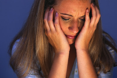
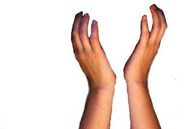
Next, I thought she looked kinda funny and plain, so i decided to get some hand to put on her face. This was difficult to find the right image, but eventually i found this::


Then I masked it to this (which I fixed later) :

Then put the hands in front of her face and made them the same colour as the face using hue/saturation, to look like this::


Then I added the snake skin, but I didn't just put back the snake skin that i just on the face, i make a whole new snakeskin layer and change the direction and size and used that::


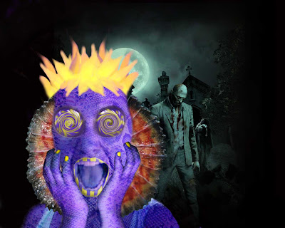
Almost finished... Next I want to give her yellow nails, so I duplicated the hand and change the colour and rubbed out everything except the nails using a mask::


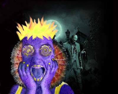
Then, I changed the colour of her top to yellow by duplicating the girl and using hue/saturation::


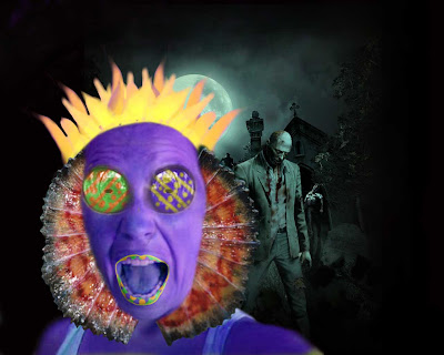
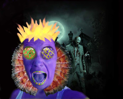
My final step was to change the hair colour a tad, I wanted it more yellow then orange, so I when to hue/saturation and instead of using a custom setting, I used a yellow boost twice, and the second time reduced it a little bit. This is my final product::

Mar 2, 2011

Avatarness - from the beginning of time


I have finished my first avatar, out of two or three, it just needs a few minor errors fixed, so I'm pretty happy with how long it took me to do it (1 week-ish) so I will hopefully get both done on time. This is the process I took from start to finish...
This was might starting image, and from that, I used a mask to rub out everything but the girl, the good thing was the hair didn't really need to be carefully done, because it didn't even need to be there as it was going to be replaced. Then I put her into a different background, because it made it easier to change things, like her hair. Then I used hue/saturation to make the sea purple. This is what it looked like after...
Then because I wanted the sea to be purple, but still have normal coloured coral and fish in some places, I had to undo the hue/saturation (because I didn't think of it before hand), then duplicate it, then recolour it. Once duplicated I used a mask and rubbed out everything but certain parts of coral. This was really hard to do because i had to zoom in heaps and using a 1p size brush, and rub out all the little bits in between the coral. THen I did the same with the fish.

THis is without the fish, just coral:
This is with the fish:


Next step was to add in the hair. This was pretty hard, but not as hard as the coral. Because the original image was on a black background it wasn't too hard. This is the original image of the anemone that I used for hair. I chose it for the colour, even though it is only a medium size image, I couldn't find any other one that suited what I needed for hair.

This is what it looked like on my avatar...

But then I thought it looked weird and needed more hair, so I duplicated the layer and flipped it horizontally, the put it over the top. Plus her fringe was kind of lopsided, so it evened it up to. It looked like this after...

Then I added the eyes, which contrary to some peoples beliefs, are actually marsupial eye, no fish eyes, although they are meant to resemble fish eyes and that is why they are not blended into the face very well.

This is the original marsupial eyes...
And this is the eyes after I used hue/saturation to make them blue. Once I had actually put the eyes on (not in this photo but before I changed it) I realised one was at a different angle, so I duplicated the left and and flipped it so they were the same...

After I did the eyes I realised they needed something else, so I decided to use eyelashes. I tried looking for some interesting ones on the internet but couldn't find anything, so I decided to just shrink the hair and use that. THen I tried making it different colour to the eyes, like purple or pink, but it didn't look right. So even though I wasn't absolutely happy with black eyelashes, I decided it was the best option. And this is what it turned out like:

Then the next step was the skin, so I made a duplicate layer of the girl, and rubbed out everything but her skin. Then I wanted to make her skin pink, so I used hue/saturation to do this. I had to chose a colour that suited the background and her eyes and hair, and was a happy sort of colour. This is what it looked like after:
Then next thing I wanted to do was add a amour like skin, so i chose to use a snake skin for this. Because i had already made the skin pink, I tried to find a pink snake skin so it would be weird with the pink skin. This was hard, because none of the images were the right pattern i wanted and the right size. But eventually I found one, which i can post because it is too big, but here is what it looked like with the scales.

Finally, the last step was the lips, which I almost forgot. To do this I had to once again duplicate the layer of the girl, and use a mask. But i had two problems with the lips. First was a couple of times when I was rubbing out, I forgot to use a mask, so they ended up being a funny shape. Secondly was the colour, I could find the right colour, lightness or saturation that I wanted, but I eventually found one that was pretty close. So the lips were my biggest hassle, however this is what is ended up like:


This is the final final final result after I tweaked a few things from the previous one: