Oct 23, 2011

Digitopia by Miwa Matreyek


Digitopia from citrusink on Vimeo.


Focus Questions

Imagery:
Digitopia is a very surreal video that uses many different things meant to symbolize and represent society and its various rituals/practices.
Hands are featured repetitively throughout the film, mostly with the arm, sometimes without.
It also includes various other body parts, heads, eyes, mouths etc.
Lots of people are also shown doing different jobs or actions, being operated on and operating, dancing etc.
A few backgrounds were used throughout: blue sky with mountains, labratory, cityscape.
A lot of the movements or actions were repeated a number of times for each scene.

Overall impression:
Initally the audience may get a slightly disturbed impression from this video. However if the meaning of the video is explored you can began to understand what Miwa Matreyek was trying to portray. The music certainly gave it a calming slightly sad mood which greatly effected the feelings the audience would experience while watching it. This calmed mood was assisted by the fluid movements the hands, people and objects made. Obviously the clip is very surreal which initially would make the audience feel disturbed. The film is about forgetting who you are and being in a dreamy state of mind, just relaxing.. That is most likely why Miwa Matreyek chose the calming music and a surreal theme, as surrealism is based on having the disorienting, hallucinatory quality of a dream. 

Visual language cues, sound cues and editing:
The music to this film is a very calming song, not too upbeat and sung in a calming low key voice, this all contributes to the relaxed theme of the video. The visual language in this film is also important: the main colours being blue, white and black, with bits of red, the blue also enhanced the theme as it is a calming colour. There is quite extensive editing of this film as the mountains are hand drawn and the hands and various body parts, laboratories, cities and additions to the body parts would have to be edited in.

The artist has used contrast and colour to emphasis the shapes and objects in the film. For example the red, black and white contrast well with the blue background and so stand out. She has used proportion, scale, repetition and movement to create emphasis on jobs or actions. Miwa Matreyek also uses line to help define the objects in the film.

Interpretation:
This film could be interpreted as trying to portray a relaxing surreal theme, much like a dream. This view could be taken from the calm music, surreal themes and visual language used.
Stephanie Rutherford found this movie quite disturbing, Courtney Palmer agreed with this and added that the music gave her chills.
The intended audience for this film is most likely adults who have artist personalities as it could not often be appreciated by others, such as teens, proven through Stephanies and Courtneys statements as they are both teenagers.
The visual language in this film gives this interpretation as the colour scheme, mostly black white and blue, gives a very calming effect. The rhythm and movement also aided to this interpretation.
The backing music of this short movie helps interpret the film in this way as it has a slow and calming tune, also the voice is very low and soothing tone.

Oct 13, 2011

ePub thingo

So I've started my pages document iBook ePub thing, I've spilt up the video into the scene so I can put them into a document. So yeh I can start that next week :) just thought i'd let you know hehe

Appraising task

This lesson we have been discussing our Appraising task and what we will be doing, we looked at videos made by Miwa Matreyek and talking about the meanings and so on. We have to pick one of her three films, and have 3 weeks to describe it on our blogs. I think i'm going to the hands one, because i can see the meaning in it. so yeh, thats about it...

Oct 3, 2011

term 4 - im bringing creative media back! yow!

today is our first day back to term 4, and Mr Powell is teaching us how to make and ePub because for our next assignment we are making an ePub.
I've already made an ePub for French this year, so i already know how to make them, which is good because it means i won't have much difficulty with this assignment.

For the assignment we are making an ePub about our animation, and what we thought when creating each scene. We also have to cut up each scene to put into the ePub, which should be.. interesting.. as i don't know if I have the scenes anymore :\ but it'll be fine . . .

Sep 14, 2011

Animation Evaluation


With my animation I had quite a few difficulties, but overall I am pretty pleased with my final result.

With the first song, ET, the difficulty wasnt the drawings, i found that easy, the hard part was the perfecting the timing. I took me a few lessons once we finished the animation to put it into iMovie, find out how off time it was, go back and fix it, then put it back into iMovie. Then check the next scene timing and repeat till i finished all the scenes.
What I also found hard were the transitions from each scene, because i really wanted them to link well together, so i really had to think about each one for a while. 
Lastly, the final animation turned out a lot different to our storyboard because a lot of the ideas we had just wouldn't work, so they had to be edited, and it was hard to think of ways to do each scene. For example the technique i used for the spinning globe took me a while to think of (using a world map in the back ground and the foreground was a sort of stencil, blacking out everything else but a circle) so these sorts of things were challenging.

The next song, Last Friday Night, involved a different set of problems and challenges as the style was very different to the other video.
At first we were going to have a photo background with Katy Perry drawn in, as this made it easier to change her body movements, however it turns out it is quite hard to draw Katy Perry haha. So we ended up using pictures and rotating, cutting, flipping and moving images to stimulate movement.
In the first scene we just flipped her and used different images to get different poses for her dancing, this was easy and didn't take long. However the next scene took me a while to come up with a technique to make her move, which was cutting off her arms or legs or whatever needed to move, and rotating them. This was both hard and easy, easy because rotating was simple, hard because when you do rotate them they don't always fit into the jointing body part perfecting. Also this effect may look unrealistic if done wrong or the picture doesn't suit it. This scene became quite useful and was used in most scenes.
I also had some difficulty with the actual images, because i was using photos of Katy Perry it meant the backgrounds needed to be photoshopped out, which with so many images of her, takes a long long time. 
Lastly, in the streaking in the park scene, I had some difficulty because it was quite hard to move her legs in the right direction to stimulate walking because i had to cut and move her legs. However this was aided with the package truck thingo on animationish, because it meant i also didn't have to move her, i just used the tool to mover her for me :) With the next scene however I didn't move each random girls legs as I didn't have the time, so I thought that no one would notice if I just had alot of girls, bunched up, and some moving, so made one cartwheel in and one tumble in to distract from the fact the others legs were still. 
The timing with this video was not that hard, i just had to fix one scene because i think we initially timed it wrong, but other then that they were fine.

With this video in general, i found the thing that helped me the most was the storyboard, i founded it made things easier to figure out when starting a new scene if i just referred back to the storyboard, it told me how long the scene was, what was in it, and the how it transitioned to the next scene.

I learnt alot of new animation techniques during the process, such as the cutting and rotating effect i used in the Last Friday Night video, and how to make a world spin and how to make girls in bikinis looks naked using black bars haha.

If i could redo this animation I would make a back up of everything, because of my losing Stephs USB : \ Also I would spend less time mucking around in class as it all eventually adds up and means less time to do the finishing touches. 

OMMMGGG finally finished!!

OK, so i was meant to post this the other day but didnt have time i was sooo busy doing my assignments!!

anyway, the other day, we were all on track nearly done, then BOOM Steph's gets sick and cant finish her scenes because she couldn't come to school, so she gave me her usb with her scenes, and by this stage i had finished all my scenes, i just had to do the final rerun scene and put in the music. So i wasn't really stressing that much. But then i lost said usb and had to red Steph's scenes again, luckily she had posted them on her blog so it was easy to recreate them, and it only took me 2 hours.

then because i was running out of time and could rerun the scenes the way i wanted for the final scene, which was to copy and paste every second frame from each scene to make it go faster, i just cheated slightly and make them go faster on animationish.

then i put them all into iMovie, and realised one scene was half of what it was meant to be, because i forgot about transition time or the timing was mucked up while we were timing it. whatever, so i just repeated the end part of that scene and added it in, but then it took over some the next scene. However for me to fix that would take too long and be too hard, because it meant fixing that scene, then opening the scene after and adding more to that, which i couldn't really do without it looking funny, so i just left it.
After that though the timing was fine, and adding the songs was easy.

Last thing was the credits which, cause i wanted really long credits and was bored, put really random things in. I listed all the stars, directors, writers, creators, animaters, bloggers, brands featured, places featured, people featured, song names and artists, llamas featured, llama trainer, carer, llama mating advice, llama scholarship provided by, backstage critical support crew (which is just people who told me it looked good haha), financially supported by and i think so other random stuff haha.

here (is a really bad quality copy of ) the final thing, but i dont think u can read the credits, sorry

Sep 11, 2011

Last few lessons :\

So after a week of camo we only have two lessons left to work on our animation, and its due on Thursday. In class today I finished scene 5 and the transition to scene 6.
We are running a bit short on time, we still have 2 scenes to do, then match it to the music, so we are running a bit off schedule, but thats ok. Steph and I are just going to try get some done at lunch and at home.Technically we only have 1 scene to go, because the last scene is just a quick rerun of all the other scenes. Steph is going to work on scene 6 tomorrow. Then we just have scene 7 to go. I'm more worried about matching the music, because I can be quite a perfectionist with that sort of thing.
So yeh, catch ya later alligator ;)

Aug 29, 2011

Video progress

Sorry I havent posted in a while, its been quite a busy couple of weeks. Steph and I are frantically trying to finish these scenes, because we have camp soon so miss a week of lessons :\ and we've only just realised these scenes take alot of photoshopping, because we have to erase a lot of the backgrounds Katy Perry is in.

But we are doing good so far, it took me a week to do all the photoshopping and get all the photos together, but after that it was soooo easy.
I finished 2 scenes in class today, which is good. I've decided because I can do photoshop on my laptop, I will do that for homework and do all the animationish in class as I don't have the program.

Because Steph is taking a while with her scenes, and I can't start the last scene till all the others ones are finished, I am going to do the photoshopping for her and help her with that. So hopefully we will finish on time. I'm just worried about the music, because last time it took us a couple of lessons to fix all the timing, so I want to finish the scenes by this week or next weekend. Fingers crossed :)

Aug 15, 2011

Storyboard - Last Friday Night
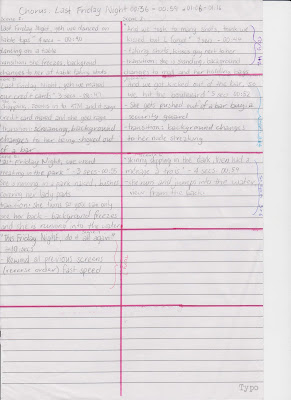
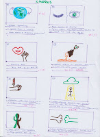
So here is the long awaited story board:


Steph and I have also decided what scenes we are going to do, I am doing scenes 1,2 and 7. Steph is doing 3,4,5 and 6. I am doing one less scenes because last time I did two more.
We have started the animation as well, Steph just takes a while to get started :\ ...
Anyway, better get to work :)

Aug 12, 2011

New video..

Ok, so steph and I have decided this week what parts of Last Friday Night by Katy Perry we are going to do and a majority of the scenes and transitions all in a story board (to be scanned it at a later date).
We have decided to do the first 'Last Friday Nights' of the chorus, and if you hear it you will understand (http://www.youtube.com/watch?v=KlyXNRrsk4A&ob=av3e) and adding the 'do it all again..' from the end of the chorus cause it sounds cool. We have written down the exact times on the story board.
For the scenes, we are basically going to match the lyrics basically, so for 'skinny dipping in the dark' she would be skinny dipping in the dark in a pool. We did skip some lines to use for transition, which is basically freezing the scene, changing the background and the position she is already in should fit the next scene (hopefully).
So yeh, that is what we have done this week, and next week we will be starting the actual animation, we have picked a short section so we hopefully will have enough time. I'll keep you updated :)

Aug 7, 2011

FINNNIIISSHHHHHHHEEEDDDDDDD!!!!!! yay.

So I've finished the video and added the music, and fixed up any timing problem, so I'm pretty happy :D Steph and I have started the next video for Last Friday Night, which is going good. Steph at the moment has started the first scene of it, with a birdseye view of a path and all the rubbish and party stuff starts appearing, its pretty good. :) 

Jul 31, 2011

Scene 10 finished!! yay!

Ok, so I finally finished scene 10, so now we just have to put them into iMovie and add the song, and we are done! So here is the scene:
and here is scene 3 and 4, which I forgot to upload:
So the next step is the second song. Steph still thinks we have time to add 2 more songs, I dont. So we are in the process of deciding which song to do, between Last Friday Night and Hot and Cold. So I shall keep you updated on our process on song choice and the video :)

Jul 25, 2011

Scene 9 FINISHED AYAYAYAY!! haha

So yeh, I finished scene 9, which means I only have scene 10, before we finalise it and possibly start another short one.
The most annoying thing about this scene was every time I opened it on animationish and moved a slide or tried saving it, the program would quit. Which was VERYYY FRUSTRATING!! I tried dragging it onto the desktop and using that file instead, didnt make a difference, so I figured it must be the file.
So instead of having scene 9 and 10 together as I normally do, I'm just going to start a new file for scene 10.
Anyway, here is scene 9, sorry I keep forgetting to post the other scene :\

Jul 22, 2011

Scene 9 and 10

So for creative media this week because I missed most of the lessons, i only got to finish scene 9, which is the spinning world, and it looks pretty good so I am happy with how it turned out. The next scene is and eye which leads into the light, and the transition to this scene is the world turns into retina (coloured part of the eye) and then yeh.

However Steph and I are thinking of stoping it after that scene and making like a remix sort of video, and add another song after and do the same type of animation video clip. We were thinking of doing another Katy Perry song, or doing more then one other song. I think we should just do one other song, and it should be Katy Perry because otherwise I don't think we will have time.. But Steph disagrees and thinks we have all the time in the world. So I said we should just finish this one and add the music, and then if we have enough time we can make others.

So yeh.. I shall keep you updated on our progress over the next couple of weeks.
xx

Jul 11, 2011

KATYPERRY VIDEO

So it's now term 3 and I've finished half of my scenes, scenes 1-4, and I've done 30 frames of scene 9. This scene (a spinning globe) was rather hard to think of how we could do it, we finally decided on getting a world map and moving it slightly to the left on each frame and painting over everything but a circle (for the globe) black, so it looks like a sphere.
At first it took a while, but then I figured out I could select all of the paint from around the globe and copy and paste that on to each frame instead of painting it every time. This lesson I've done about 25 frames, which is pretty good.
We also decided that for the transition the world will turn into the coloured part of the eye for our next scene, which won't be difficult to do.
So yeh, oh and Mr Powell isnt here which is really sad and we miss him :( Creative Media just isn't the same without him, we are all completely lost and wish he was here haha.

Jun 9, 2011

Progessnessness

So far for my animationish for this week i have finished(ish) scene three and four and im just doing the transition to scene five, YAY!!! I have decided to have the glowing body blow up, so it will be easy to just add Steph's scenes in after. Mr Powell showed me how to do that, by using the eraser and rubbing lines through the person randomly then frame by frame moving them out and off the screen. So that should look pretty coooolll hehe
Steph and I are pretty proud of how much we have done, I'm pretty sure she has done 4-5 scenes, so we have both finished what we set basically and we are starting our new ones. Then once we both do those four each we are done, we just put it all together and we are FINISHED!! yayayayayayay!!! hahaha

Jun 5, 2011

Scene 1 and 2 - finished

I finished scene 1 and 2, which is the drum and the tree scene. I have started my 3rd scene so i have done quite a lot, at this rate Steph and I think we may have enough time at the end to maybe add more to the movie or make another short one.
THis is the first two scenes:

May 25, 2011

STORYBOARD - ET
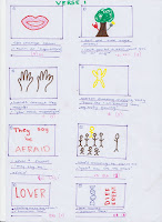
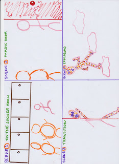
Ok, so this took a while, but this is my story board for our ET video clip, except Steph and I have changed a few things. Firstly, for the first scene, we changed it from the lips to drums playing to the beat.

We have decided which scenes we are doing, and for the first 4 scenes how we are transitioning. I am doing the first four, Steph is doing the second 4, I'm doing the next four and so on. In total there are 16 scenes.
Our time line is:
with 16 scenes, 3 weeks this term, 8 weeks next term, 3 lessons per week, we have 33 lessons.
16 scenes and 33 lessons is about 2-3 lessons per scene. Steph and I are confident that this is a good timeline, because each scene isn't that long or hard.
So I better get started!

May 19, 2011

STORYBOARDing

This is my story board for our first idea, Candy Land, but we didn't finish it because we changed ideas:


And this is the character board:

May 16, 2011

ET!!

OK, so Steph and I have decided to change ideas, and instead of the Candy Land idea, which keep changing and getting to complicated to create, we have chosen a more simple idea, inspired by Steph's Katy Perry experience, to do a video clip to the song ET, by Katy Perry. We're going to use animationish, and we chose this song, because we can do really cool like drawings and stuff. We are going to up to the end of the first chorus, which is 1m and 11sec, but if we get enough time we will do the second verse and chorus as well. I have already started photoshopping some photos for the video. We have finished our storyboard, and next lesson we will start making it.

May 15, 2011

Our movie !!

Ok, so Steph (my partner for the assignment) and I have decided to do a animationish and iStopmotion movie. Its about a boy (Scott) who is being bullied, and the bullies (Stan and Matt) are chasing him at school, so he runs into this room and he turns to candy. So he pokes his head out the door, and half of his body is normal and half is candy. So he explores the world a little, then the bullies chase him in. So they chase him for a while, then he is back at the door, where he came in. So he runs out, and locks the door so they are trapped in there. We plan on using iStopmotion for when he is in the real world, and Steph and I get dressed up as the characters, then using animationish for the candy world.
Steph and I have started the story board and I also made a character board, showing the characters.

May 9, 2011

iStopMotionnessness

Over the last week or so, we have learnt lots of different skills with iStopmotion. We watched some peoples animations and iStopmotions from last year, and some girl who did iStopmotion, exported the images off her movie, and edited them in photoshop. She edited every single image from Photoshop, which would of taken sooooo long! But then Mr Powell showed us a little trick to make things quicker, using this thing called action. So what you do, is you create a new action, and press this little record button. Then, you can the image in what ever way you want, you might add an effect or warp the image. Then you save and exit then image, and press stop. Then you go to the next image that you want the same thing done, and press play. This means you can do 30 or 50 images in a couple of minutes. I tried this with a video of Steph and I and tried 2 different effects. This is them:
This is the first effect called Fresco:


This is the second effect called Grain:

Apr 27, 2011

Walking Man

So, over the last week or so, we have been learning how to use animationish, and we had to make a 'walking man' animation, which is uses the basic techniques of animationish. I used trace to trace an image that shows each motion in walking. So I imported an image off the internet in the background showing each motion of walking, traced them, then deleted the image. Because I had difficulty drawing a perfect circle head, I put a hat on him. I can use this technique with my assignment if I use animationish, if I have trouble with drawing anything.
This is him walking on the spot:


This is the image i used to trace:

Apr 11, 2011

ANIMATIONishness

Today in Creative Media, we practiced using animationish, and I created 2 little animations in the lessons. First was just me playing around:


Second was an exercise to practice using the animation to create speed and using different shape because this will be needed for our assignments. This is it:


Mar 25, 2011

Avatar Reflection/Evaluation

Avatar Reflection/evaluation:

With my avatar I had a few difficulties, but I am pretty pleased with my result.

Something I found hard was finding the right image for my avatar, because I already had an idea in my head, & so finding the perfect image could take even up to an hour. Secondly I also found it a bit difficult to do the lips perfectly, especially on my last avatar, because even though it was a large image, when I zoomed in to do the lips, it was very pixelated.

I also had some trouble with time management, especially with my blog. This was because I wanted to put the whole process at once not separately.

Something that really helped with the process was my personality profile (planning). I didn’t use the personality profile planning sheet given to us on Blackboard, however I wrote it myself & this helped me to plan the making of my avatar. It was very useful because I keep referring back to it to check if I had forgotten anything.

While making my avatars, I learnt a lot of skills & techniques such as different types of liquify, how you use a preset in hue/saturation & many more skills.

I am mostly satisfied with my end result. However, I think that if I had spent more time trying to perfect certain things, I would of been happier with my final avatars.

If I was to redo my avatar, I would make sure that I as always using a mask & not rubbing out completely because not using a mask often set me back quite a bit.

3RD AND FINAL
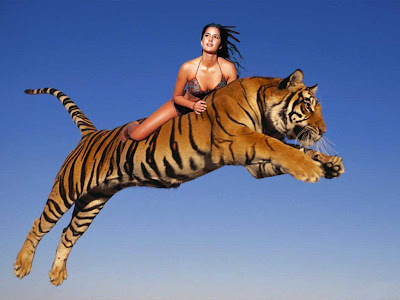


This is my final avatar, and is just an extra one i decided to do, but isn't a good as my other ones.
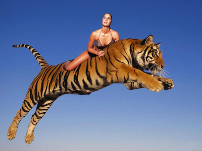
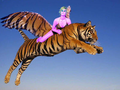
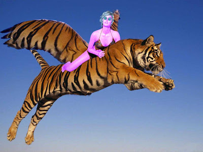
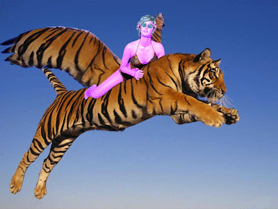
My starting pictures were these, and I put the girl on top of the tiger because she is flying on the tiger.

Then it looked like this:


Then I masked out her hair:


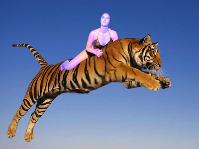
Next i wanted multicoloured skin, so I duplicated the skin twice so I had three different one, the made then all different colours, and using the same technique as I did for my 2nd avatar with the eyes and lips, I rubbed out certain parts on each layer to reveal the layers below, making a pattern. I also used the original girl to keep her clothes the same colour and not changed colour::


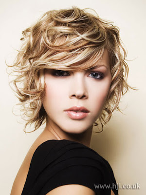
Then I did the same with the hair I chose. This is the original hair::

THis is it on the girl and coloured::


Next was the eyes, with I just used exactly the same from my first avatar::


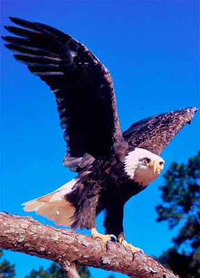
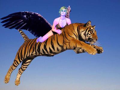
Then I added eagle wings to the tiger so i could fly, therefore making it a teagle. This is the eagle:


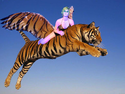
ANd this is them on the tiger:


Then I selected a certain part of the tigers pattern to use as an overlay on the wings to make them look like they belonged::

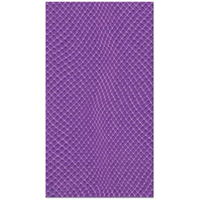
Then I decided I didn't like the multicolour skin, and it meant I could use a snakeskin or would be to hard, so i just make the skin pink, because it is their neutral skin colour thing (as mentioned in Personality Profile). Plus I added a snake skin to it. THis is the snake skin::


This is it changed to pink with the snakeskin::


Because I changed the skin to pink, it meant I had to change the hair as well back to just blue, and I also did the lips and made them blue. This is with the hair::


This is with the lips, however, I couldn't get them right, and they looked really wrong, so I just left them:


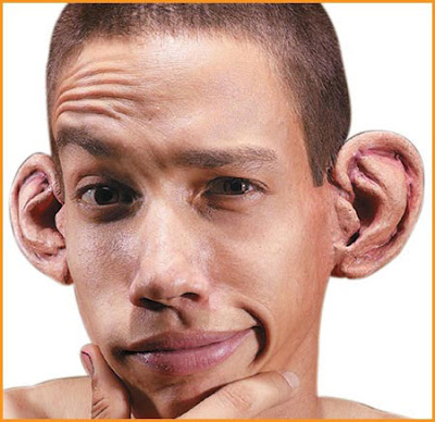
Next I added bigger ears that I got off the internet. I used these ears:


And put on they looked like this::

Finally, I duplicated and flipped the ear and used hue/saturation to make it the same colour as the skin. This is the final image::

Mar 20, 2011

My 2ND avatar....


Ok, so because my second avatar is from the same race as my last, the process will be mostly the same, however, because they react differently with this emotion, it has some very different parts. SO here is how I did it::
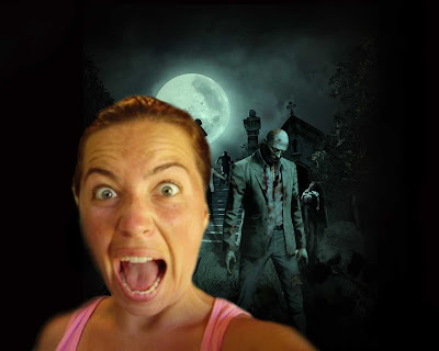
My starting image was this:
THen i masked it and put it in a scary background (ohhhhhhh, SCARY!!!):

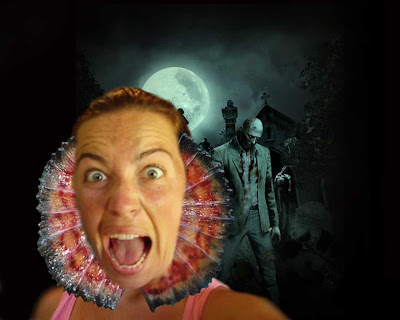
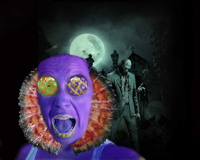
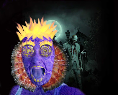
NExt step in the longggggg process was to add the water dragon/lizard feature that they adapt when they become scared or defensive. I chose a water dragon because i wanted the fin thing around the neck, and this is what it looked like on the girl:
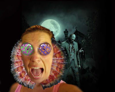
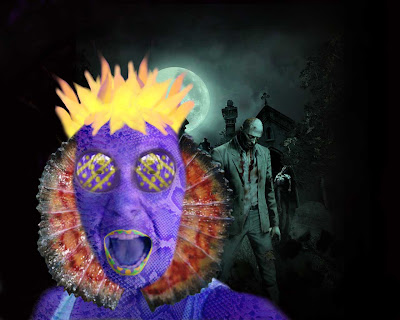
THE next step was the eyes, which i later changed, but I what I did was get the eyes from my last avatar, and change the colour. But because they needed a pattern, i duplicated them and changed the colour, for each layer of each eye, then rubbed out parts so you could see the colour of eye underneath and it created a pattern. I used these colours because they contrast each other, and look cool. This is a picture of it:
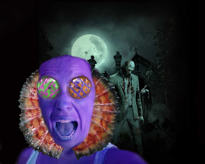
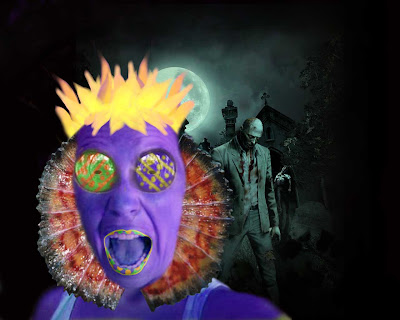
Next step was the skin. I had to change the colour of the skin to purple, and did this using hue/saturation:

Also, i wanted to make her look more scared by giving her bigger pupils, but i didnt like it, so lef tit, but this is what it looked like:::

Next step was the lips, and I did the same process with the lips as the eyes, just a slightly different pattern. I found it hard to make the lips blend into face easily because of the colour. But this is how it turned out...

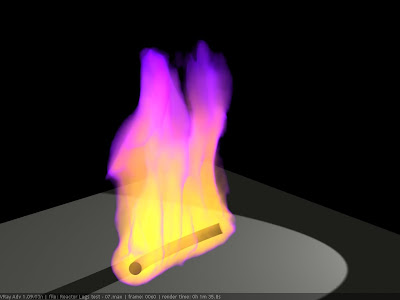
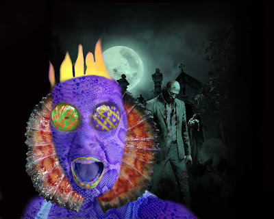
Next was the hair. It took me a long time to think of and find what I was going to use for hair. I finally found some yellow flames which were perfect, it had purple at the end, but i just got rid of it and only used the yellow. The flames also helped with portrayed her emotion, which is scared. The problem was it looked really weird with just one layer of it, so i duplicated it alot of times to give it more volume. (It has the snakeskin on it, even though i hadnt done it at this stage, because i forgot to get rid of it when saving the JPEG) This is the original image of the flame::


This is it unduplicated::


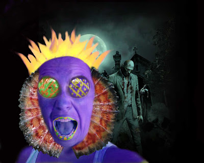
This is it duplicated:

But then i thought the hair kind of looked like a crown, and didnt fit, so instead of changing it completely, i just added a fringe. I did this by selected certain layers of hair, duplicating, flipping and resizing them then masking and erasing them so that they looked like a fringe. then to give it more volume I just duplicated it again, to look like this:
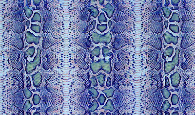
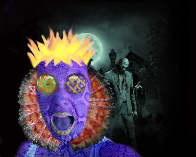
THe next step was the snakeskin, which again I probably done earlier, but anyway. I had to find a purple snakeskin, and so I chose this one::

And after I masked it and added it, it looked like this:
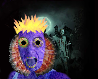
After this, I had finished doing all the things that i put in my personality profile, so because I wasn't entirely happy with my result, I started changing things to see what they looked like. First I tried bigger pupils to make her look more scared. I did this by making 2 black circles and just placing them on the eyes::

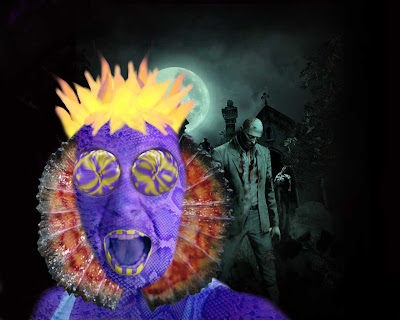
I didn't really like this, so I left it how it was. Next thing was the eyes, i changed the colour because I wanted the eyes to match::

Then to match the eyes I changed the lips and made them stripped by changed the mask.
Then, I wanted to change the eyes, so I tried different liquify techniques on the eyes and picked my favourite. This was the bloat on the eyes, but i didnt really like it::


This was just the normal liquify technique, and i didnt really like it either::


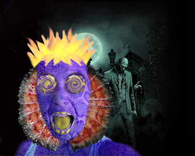
This is the final technique and its swirl, and this is what i chose because it looks cool::
Then I tried a yellow tongue using a mask and hue/saturation , which looked really bad::


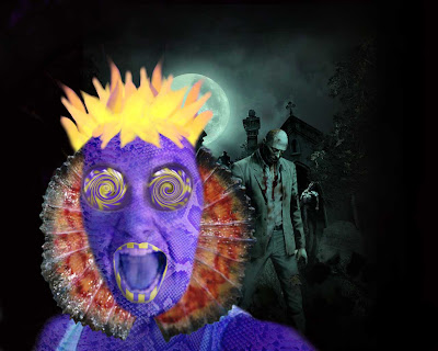
THen to make her look even more scared again, I made a new layer of her lips and transformed them to a bigger size::


Next i tried eyelashes, using the hair and decreasing the size, but this looked really bad::
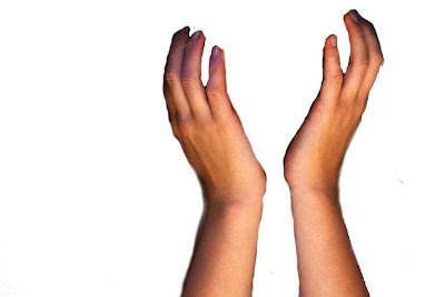
Next, I thought she looked kinda funny and plain, so i decided to get some hand to put on her face. This was difficult to find the right image, but eventually i found this::


Then I masked it to this (which I fixed later) :

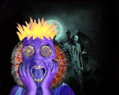
Then put the hands in front of her face and made them the same colour as the face using hue/saturation, to look like this::


Then I added the snake skin, but I didn't just put back the snake skin that i just on the face, i make a whole new snakeskin layer and change the direction and size and used that::


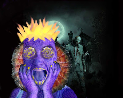
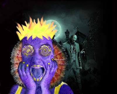
Almost finished... Next I want to give her yellow nails, so I duplicated the hand and change the colour and rubbed out everything except the nails using a mask::


Then, I changed the colour of her top to yellow by duplicating the girl and using hue/saturation::


My final step was to change the hair colour a tad, I wanted it more yellow then orange, so I when to hue/saturation and instead of using a custom setting, I used a yellow boost twice, and the second time reduced it a little bit. This is my final product::